A7. Configure the POS screen ⭐🔗
The most important chapter of the installation
The POS screen is what the cashier sees and touches all day. PosCaisse lets you compose it entirely yourself, like a dashboard: you place widgets (categories, cart, payment buttons, shortcuts…) on a grid, you size them, you color them, then you apply. Well designed, it saves precious time on every sale.
In brief🔗
The POS screen editor is a visual drag-and-drop editor: a widget palette on the left, a layout preview in the center, and appearance settings. You build the custom sales interface.
Who / when🔗
For the Admin (or an authorized employee), at installation, then each time you want to reorganize the interface or add a shortcut.
How to access🔗
Admin → POS screen.
Requirements🔗
🔑 Manage layout (MANAGE_LAYOUT)
Screen tour🔗
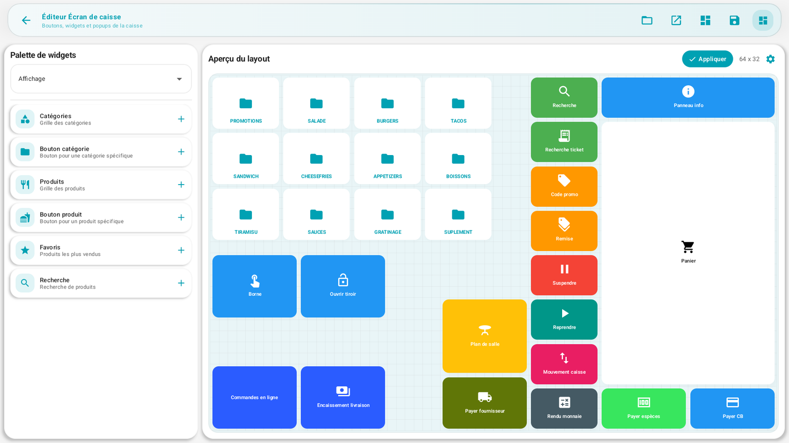
| Area | Role |
|---|---|
| Widget palette (left) | All the available widgets, sorted by category. A + adds the widget to the layout. |
| Layout preview (center) | The grid where you place and arrange the widgets; reflects exactly the final result. |
| Apply (top) | Saves and applies the layout to the sales screen. |
| Save | Saves the layout in Saved layouts (without necessarily applying it). |
| Templates | Start from a pre-designed layout (Empty, Classic, Compact, Fast-food). |
| Popup configuration | Appearance of the window that displays the products of a category. |
| Settings | Grid, screen background, widget relief. |
Understanding the grid🔗
The layout is based on a grid of cells (the preview shows for example 64 × 32). Each widget
occupies a rectangle of cells (width × height). In Settings → Grid, you set the number
of cells and the starting size of the widgets. The Refine the grid option "multiplies the tiles
without changing the design" — handy for finely aligning two widgets.
Tip
The more cells the grid has, the more precisely you place the widgets. Start with a Template close to your need (e.g. Fast-food), then adjust.
The full widget catalog🔗
The widgets are sorted into 10 categories. Here is each widget and its exact role.
🟦 Display🔗
The widgets that show the menu to the cashier.
| Widget | Role |
|---|---|
| Categories | Grid of categories (the product families as tabs/buttons). |
| Category button | A button for one specific category (direct shortcut to a family). |
| Products | Grid of products (the sellable items, with photo and price). |
| Product button | A button for one specific product (direct shortcut, e.g. dish of the day). |
| Favorites | The best-selling products, accessible at once. |
| Search | Product search field by name. |
🛒 Cart & Order🔗
| Widget | Role |
|---|---|
| Cart | The list of items + the total. The central widget of the sale. |
| Order type | Choose Dine-in / Takeaway / Delivery. |
| Floor plan | Table selection (for table service). |
| Customer | Attach a customer name / loyalty to the order. |
| Order note | Add a remark to the order (e.g. "no salt"). |
| Order no. | Displays the order number. |
⌨️ Entry🔗
| Widget | Role |
|---|---|
| Numeric keypad | Enter a quantity or an amount. |
| Quantity buttons | Fast +/- buttons to adjust quantities. |
💳 Payment🔗
| Widget | Role |
|---|---|
| Pay cash | Take payment in cash. |
| Pay card | Take payment by bank card. |
| Split payment | Settle with several means of payment at once. |
| Meal voucher | Take payment with a meal voucher. |
| Change due | Change calculation. |
⚡ Quick actions🔗
| Widget | Role |
|---|---|
| Delete item | Remove an item from the cart. |
| Cancel order | Cancel the entire order in progress. |
| Hold | Set the order aside to serve another customer. |
| Recall | Recall a held order. |
| PDA | View the orders sent from the server PDAs. 🧩 |
| Kiosk | View the orders sent from the kiosks. 🧩 |
| Shared | View the orders sent from the shared screen. 🧩 |
| Discount | Apply a discount. |
| Promo code | Enter a promo code. |
🎁 Loyalty & Promos🔗
| Widget | Role |
|---|---|
| Loyalty | Slot intended for a loyalty program. To be used only if this journey is configured. |
| Promotions | Quick access to the configured promotional offers/categories. |
🌐 Online orders 🧩 (Online ordering module)🔗
| Widget | Role |
|---|---|
| Online orders | The orders received from the app/web. |
| Delivery payment | The payments on delivery. |
| Order alerts | Notification of new orders. |
🖨️ Peripherals🔗
| Widget | Role |
|---|---|
| Open drawer | Open the cash drawer manually. |
| Reprint | Reprint the last receipt. |
ℹ️ Information🔗
| Widget | Role |
|---|---|
| Clock | The current time. |
| Cashier info | The name of the logged-in cashier. |
| Daily total | Day-tracking indicator/shortcut according to the layout used. |
| Info panel | Combined Date / Cashier / Total block. |
🛠️ Management🔗
| Widget | Role |
|---|---|
| Pay supplier | Settle a supplier from the register (cash out). |
| Cash movement | Cash ins and outs. |
| History | The latest sales. |
| Receipt search | Find a receipt by its number. |
| Refund | Refund a receipt. |
| Void transaction | Void a transaction. |
| End of service | Close and log out. |
| Log out | Change cashier. |
The 🧩 symbol
The widgets marked 🧩 are only useful if the corresponding module is active (Online ordering, Kiosk, PDA, Shared screen). If they are placed without the module, they remain without effect.
Step-by-step procedures🔗
Add a widget🔗
- Open Admin → POS screen.
- In the Widget palette (left), expand the desired category.
- Tap the widget's +: it appears in the Layout preview.
Move and resize a widget🔗
- In the preview, drag the widget to position it.
- Stretch its edges to enlarge/shrink it (each widget has a min/max size). For example, the Cart stretches in height, the Products grid occupies a large area.
Configure a widget🔗
- Tap a placed widget to open its Widget configuration (depending on the type: targeted category, targeted product, colors, size…). Confirm or Cancel without changing anything if you are exploring.
Configure the products popup🔗
When the cashier taps a category, the products can be displayed in a popup. Via Popup configuration: - Choose the size: Small, Medium, Large, Full screen. - Set the colors (background, header, product card, price, close button). - You can have a default template and per-category configurations.
Set the appearance (Settings)🔗
- Grid: number of cells and starting size of the widgets; Refine the grid for a precise alignment.
- Register background: general background color (or leave the theme background).
- Widget relief: Free colors or Elegant surface, with adjustment of the shadow, the corners (rounded) and the spacing between widgets.
Start from a template🔗
Via Templates, choose a starting point:
| Template | For what |
|---|---|
| Empty | Build from scratch. |
| Classic | Traditional layout, categories at the top. |
| Compact | Optimized for small screens. |
| Fast-food | Optimized for fast service. |
Save then apply🔗
- Give a Layout name.
- Save: the layout is saved in Saved layouts (you can have several).
- Apply: it becomes the active layout on the sales screen ("Layout applied successfully"). The active layout is marked Active / In use.
Messages & edge cases🔗
- Apply ≠ Save: Save sets aside, Apply actually puts into service on the register. As long as you do not apply, the sales screen does not change.
- A widget has min/max sizes: it cannot be shrunk below its minimum size (e.g. the Cart needs room to stay legible).
- You can manage several layouts (e.g. a "lunch service" layout and an "evening" one) and switch via Saved layouts.
Tips🔗
- Start from a template close to your business, then customize: faster than starting from scratch.
- Place the most used widgets (Pay cash, Pay card, Cart) where the cashier's thumb falls naturally.
- Reserve Product buttons for your best-sellers: one tap instead of navigating through the categories.
- Use the Info panel to display date/cashier/total in a single compact widget.
- Test your layout with a cashier before the rush.
See also🔗
- A4. Categories · A5. Products (the content displayed by the widgets)
- A9. Floor plan (tables and areas displayed by the Floor plan widget)
- A8. Peripherals (Open drawer widget, printers)
- Part B — Cashier journey (the use of widgets on a daily basis)