A6. POS Screen🔗
In short🔗
The POS screen is a visual drag-and-drop editor that lets you compose the layout of the register's buttons: categories, products, cart, numeric keypad, payment buttons… You design the layout from the back office, then apply it to the POS.
Who / when🔗
For the manager who wants to tailor the POS to their service: putting best-sellers front and center, building a fast-food layout, or simplifying the screen for new staff.
How to get there🔗
Menu Management → POS Screen
Prerequisites🔗
🔑 Manage the POS screen
Screen tour🔗
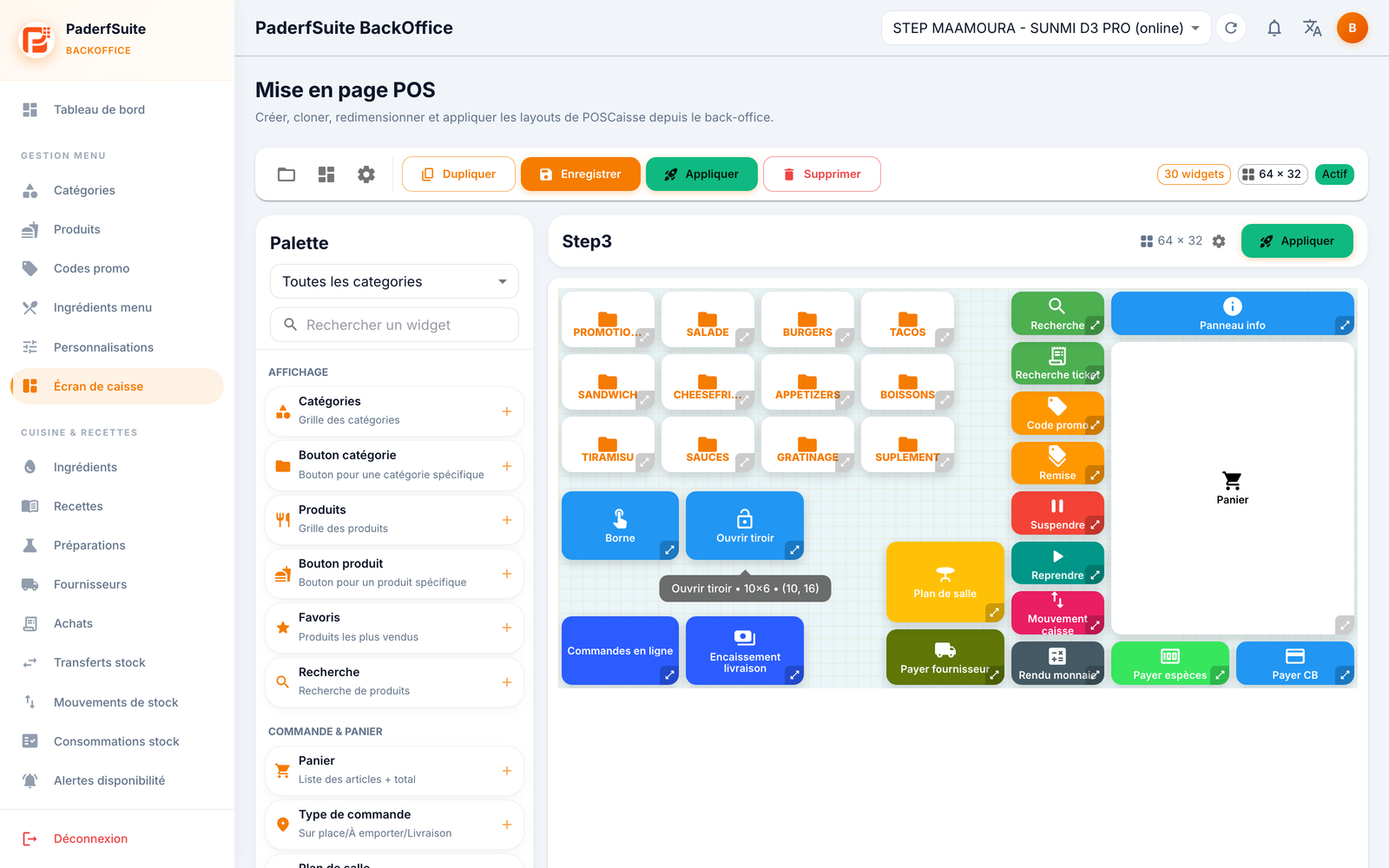
The screen is split into two areas:
- On the left, the Palette: the list of available widgets, grouped (Display: Categories, Category Button, Products, Product Button, Favorites, Search… ; Order & Cart: Cart…). A category filter and a search box help you find a widget.
- On the right, the canvas: a grid where you drop and arrange widgets to recreate the POS screen.
At the top, the toolbar offers: My Layouts (open a saved layout), Templates, Grid Settings, Duplicate, Save, Apply (activates the layout on the POS) and Delete. Badges show the number of widgets, the grid dimensions (columns × rows), the Active state, and an Unsaved marker when changes are pending.
The widget catalog🔗
The palette groups widgets into ten families. Here is each widget and its role.
Display🔗
- Categories — the grid of all categories.
- Category Button — a button to a specific category.
- Products — the grid of products.
- Product Button — a button to a specific product.
- Favorites — the best-selling products.
- Search — product search.
Order & Cart🔗
- Cart — the list of items in the order and the total.
- Order Type — dine-in / takeaway / delivery.
- Floor Plan — selecting a table.
- Customer — the customer's name and loyalty.
- Order Note — a free-form note on the order.
- Order No. — the order number.
Input🔗
- Numeric Keypad — entering a quantity or an amount.
- Quantity Buttons — quick +/− buttons.
Payment🔗
- Pay Cash — cash payment.
- Pay Card — bank card payment.
- Mixed Payment — settlement combining several methods.
- Meal Voucher — payment by meal voucher.
- Change Due — calculating the change to return.
Quick actions🔗
- Delete Item — removes the selected item from the cart.
- Cancel Order — cancels the entire current order.
- Hold — sets the order aside to resume it later.
- Resume — resumes a held order.
- PDA — orders sent from the server PDAs.
- Kiosk — orders sent from the kiosks.
- Shared — orders sent from the shared screen.
- Discount — applies a discount.
- Promo Code — entering a promo code.
Loyalty & promos🔗
- Loyalty — the customer's points and rewards.
- Promotions — the current offers.
Online orders🔗
- Online Orders — orders received via the app/web.
- Delivery Collections — payments to be collected on delivery.
- Order Alerts — the new-order notification.
Peripherals🔗
- Open Drawer — opens the cash drawer.
- Reprint — reprints the last ticket.
Information🔗
- Clock — the current time.
- Cashier Info — the name of the logged-in cashier.
- Daily Total — real-time revenue.
- Info Panel — a combined date / cashier / total panel.
Management🔗
- Pay Supplier — pays a supplier from the POS.
- Cash Movement — cash put into and taken out of the drawer.
- History — the latest sales.
- Ticket Search — finds a ticket by its number.
- Refund — issues a refund.
- Void Transaction — voids a transaction.
- End Shift — closes the session and logs out.
- Log Out — switches cashier.
Tip
There's no need to add every widget: build the screen with the ones that fit your service. Some widgets (PDA, Kiosk, Shared, Online Orders, Loyalty…) are only really useful if the corresponding module is enabled on the POS.
Step-by-step procedures🔗
Compose a layout🔗
- Drag a widget from the Palette onto the canvas.
- Position it and resize it on the grid.
- Double-click (or open the configuration) of the widget to set its parameters: label, colors, and options specific to the type (category, product, online order, cart, numeric keypad, info, clock, cashier…).
- Repeat for every button you want.
Start from a template🔗
- Click Templates.
- Choose a template: Empty, Classic, Compact or Fast-food.
- Then adjust freely.
Set up the grid🔗
Open Grid Settings to define the number of columns and rows, the sizes, the background, and the visual rendering (relief, shadow, rounding).
Save and apply🔗
- Click Save, give the layout a name, and indicate whether it should be active.
- Click Apply to activate the layout on the POS right away.
Duplicate or delete🔗
- Duplicate creates an editable copy (handy for testing a variant).
- Delete removes the current layout.
Messages & edge cases🔗
- The Unsaved badge flags pending changes: save before leaving so you don't lose anything.
- Apply is the step that makes the layout visible on the POS; a layout that is saved but not applied is not used in service.
Tips🔗
- Start from a template close to your needs to save time, then customize.
- Duplicate a working layout before experimenting: you keep a safe version.
- Place the best-selling Categories and Products widgets at the top to speed up order taking.